 (Image source: Midjourney)
 In the fast-paced digital landscape of today, mobile-first design has become vital for e-commerce success. With the majority of consumers now shopping on their smartphones, optimizing an e-commerce website for mobile devices isn’t just optional — it’s essential. A mobile-optimized site enhances user experience, reduces bounce rates, and directly impacts conversions. Let’s explore the key elements of mobile-first design and how they can transform your e-commerce platform.
When you focus on mobile-first design principles, you create a seamless, intuitive, and visually engaging experience that keeps shoppers coming back. Whether users are browsing, comparing prices, or making purchases, every interaction should feel effortless, quick, and intuitive.
Prioritize Navigation for an Intuitive Mobile Experience
One of the most critical aspects of mobile-first design is ensuring user-friendly navigation. Smartphones have smaller screens, and as a result, navigation needs to be simple and efficient to avoid frustrating users. Users should feel confident exploring your site without unnecessary clicks or confusion.
Here are some navigation tips for creating a seamless mobile shopping experience:
- Simplify menus so they are compact and intuitive on smaller screens.
- Implement a clear and visible search bar for users to find products easily.
- Ensure transitions between product pages and categories are seamless and fast.
- Minimize unnecessary scrolling by focusing on an easy-to-access layout.
The goal is to make it as easy as possible for users to find what they’re looking for. Users expect intuitive browsing, so invest time in creating a streamlined menu and accessible pathways through your site’s categories.
When navigation is smooth and well-optimized, customers are more likely to stay engaged with your website and complete their shopping journey without distractions.
Build a Responsive Layout That Adapts to Every Device
Responsive design ensures your e-commerce website offers a consistent and visually appealing experience across all devices. In mobile-first design, having a layout that adjusts itself seamlessly to different screen sizes is a must. Whether users are on a smartphone, tablet, or desktop, the site should maintain ease of use, design integrity, and functionality.
A responsive layout automatically resizes images, adapts buttons, and adjusts menus so the user can view content without zooming or losing context. With a responsive design, customers won’t face glitches, distorted images, or misplaced text. These details make all the difference in creating trust and ensuring usability.
Responsive design allows e-commerce websites to:
- Maintain visual clarity and professionalism regardless of device.
- Ensure images and content scale properly without requiring excessive scrolling.
- Allow users to shop easily, no matter their screen size.
Investing in a responsive design isn’t just beneficial for user experience — it can also improve SEO rankings. Google prioritizes mobile-friendly websites, so implementing a responsive design gives your e-commerce site a better chance of being visible in search results.
Optimize Speed and Performance for Mobile Users
Speed is critical in the mobile shopping journey. Mobile users expect quick responses, and a slow-loading site can lead to frustration, higher bounce rates, and abandoned carts. It’s essential to ensure your e-commerce website runs smoothly on mobile devices by implementing optimization strategies to reduce load times.
Here are actionable ways to boost mobile site performance:
- Compress and optimize images to reduce file size without sacrificing quality.
- Minify your website code (HTML, CSS, JavaScript) to streamline loading time.
- Enable browser caching to allow repeated visitors to load the site faster.
- Use a content delivery network (CDN) to distribute website data efficiently.
Users often expect mobile websites to load in seconds. When you improve your website’s speed, you not only enhance user satisfaction but also improve search engine rankings. A fast, seamless experience keeps customers browsing longer and improves your chances of closing a sale.
Streamline the Checkout Process with Simplicity in Mind
The checkout stage is one of the most pivotal moments in the shopping journey. If it’s complicated, lengthy, or requires too much effort on a small mobile screen, customers are more likely to abandon their carts. Streamlining your checkout process is a vital component of mobile-first design because mobile users demand convenience and simplicity.
To optimize your e-commerce checkout experience for mobile users, consider the following strategies:
- Reduce the number of steps in the checkout process by simplifying forms and information requests.
- Offer autofill options to save time and effort during payment.
- Incorporate a guest checkout option to make the buying journey faster.
- Ensure that buttons and fields are large enough for easy interaction on touchscreen devices.
Making the checkout process frictionless will result in higher conversion rates. Offering users the option to pay quickly and easily with fewer clicks allows them to move from decision to purchase without hesitation.
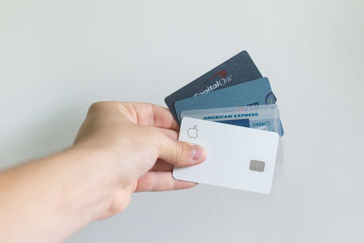
Implement Secure Mobile Payment Methods
Mobile payment options have become a standard expectation among today’s online shoppers. With technology advancing, mobile payment methods like Apple Pay, Google Pay, and other mobile wallet options have become trusted, efficient ways for customers to complete purchases. Incorporating these options not only improves convenience but builds trust and security for shoppers.
Offering multiple mobile payment options allows e-commerce sites to:
- Simplify the checkout process by reducing the need for customers to input credit card information manually.
- Improve customer trust by demonstrating that secure payment options are available.
- Enhance the shopping experience by providing seamless and time-saving alternatives.
These payment gateways not only make it easier for users to purchase from their mobile devices but also ensure peace of mind by offering encryption and fraud protection. Mobile payments are convenient, fast, and effective, making them an integral part of a mobile-optimized e-commerce experience.
Optimize Visual Hierarchy and Call-to-Action Placement
Visual hierarchy and call-to-action (CTA) placement are vital for guiding mobile users through their shopping journey. When designing for mobile-first experiences, ensure that important visuals, promotions, and CTA buttons are easy to locate and interact with. These elements must capture attention quickly to drive conversions and engagement.
Visual hierarchy should focus on drawing attention to key promotions, products, or offers by emphasizing bold images, banners, or strategically placed headlines. Similarly, ensure CTA buttons are:
- Easily visible and clickable with contrasting colors.
- Strategically placed to encourage action at every stage of the shopping journey.
- Optimized for touch interfaces with sufficient size and space.
When users can quickly identify where to go and what actions they need to take, they’re more likely to engage, add products to their cart, and complete purchases.
Incorporating these elements of mobile-first design will elevate your e-commerce website by focusing on user experience, usability, and seamless navigation. From intuitive navigation and responsive layouts to quick load speeds, streamlined checkouts, mobile payment options, and optimized visual hierarchy — each design choice plays a role in creating a frictionless shopping journey.
With these strategies in place, you can create an e-commerce experience that isn’t just visually appealing but also functional, intuitive, and mobile-friendly. Prioritizing mobile-first design ensures that your customers can enjoy a smooth shopping experience no matter where they are or what device they use.


.jpg)